About Carets
Carets is a shoemaking company. They claim their shoes represent the highest intersection of style and comfort, stating:
“There will always be shoes more stylish than ours, and there will always be shoes more comfortable than ours. If you care about just style or just comfort, you would be better served by other shoes. If you care about both style AND comfort, look no further. We've packed our shoes to the max with both style and comfort, and you won't find another shoe that does it the way we do.”

Initial requirements
Carets wanted to redesign their Mobile and Desktop websites to improve user experience and visual identity. Through interaction with customers, they realized that people felt a risk buying from them. The lack of trust in their websites across all platforms deterred users from spending $350 on a pair of shoes.
Aim for new carestco.com
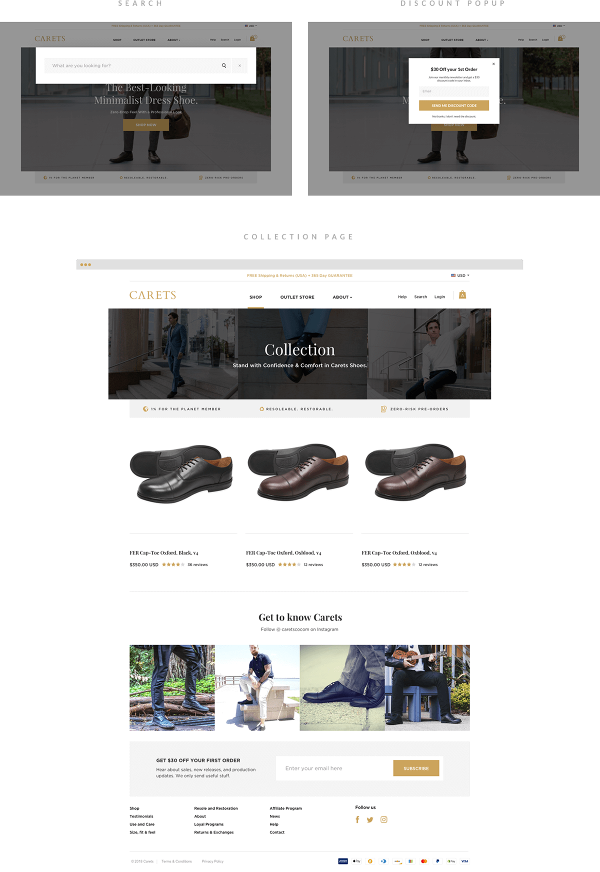
Like many e-commerce companies, Carets' goal for the new website was to increase conversion and reduce the bounce rate. However, they also had an interesting aim to enhance the shopping experience across all platforms, to help customers shop without fear or risk. In short, they sought to create a trustworthy website with a visually reassuring tone.

Survey
I spent 2-3 hours with the website and I made a questionnaire for Carets, thanks to them for providing me the detailed answers of every question I asked but beyond that, I needed customer's feedback on what they are thinking when they shop from Carets. Fortunately, they already had a survey which helped me to recognize a few problems. Majority of the customers looking for more collections and more colors for the shoes and clearly that was not my part though Carets is already working on it. I found some helpful feedback on the websites and mobile shopping experience.

Analysis of the problem
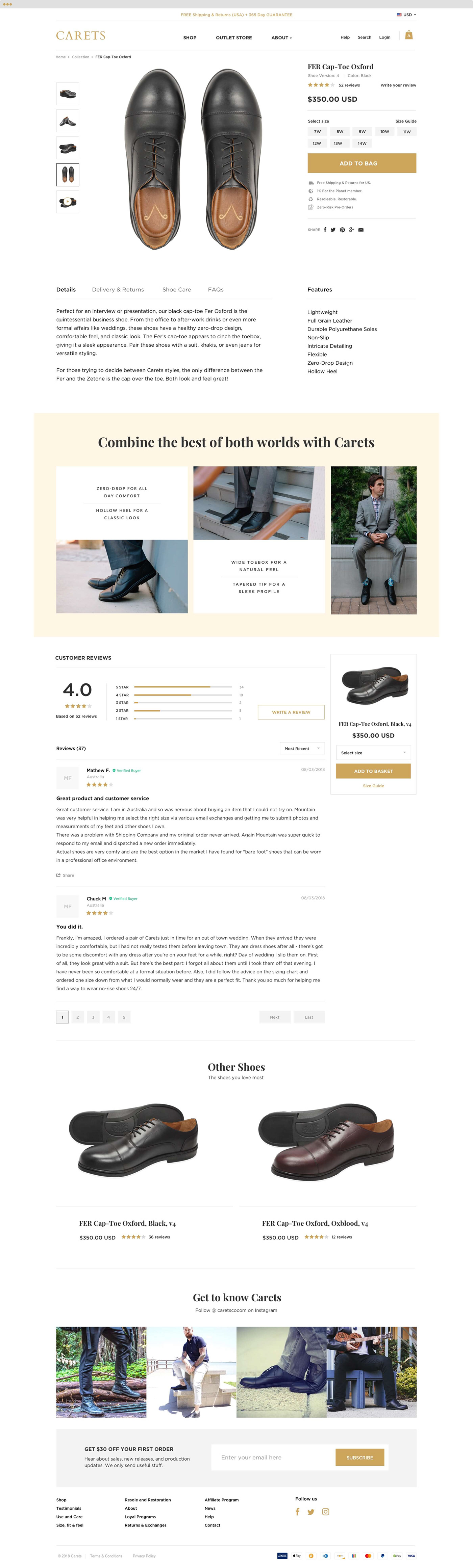
Carets doesn't have an extensive website; they're currently selling just 3 shoe styles (with more launching soon), but the website wasn't providing the necessary information. My task wasn't just a simple redesign of the existing site but rather a complete overhaul of the entire experience. This included new content, photography, branding, and a revamped brand voice tone.
I noticed their previous website contained all the information a customer might want to know before making a purchase, but it wasn't always presented in the most accessible or relevant places. This was particularly evident on the home and product detail pages, where superfluous information was sometimes provided.
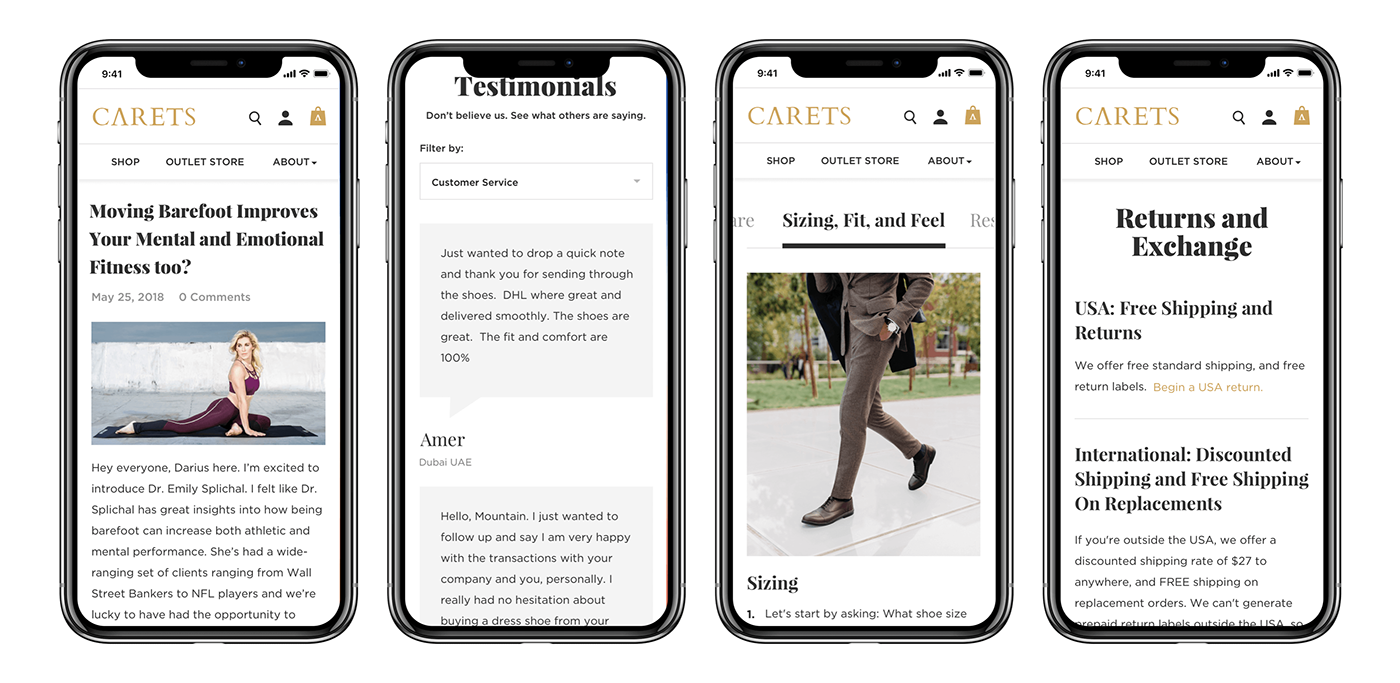
Shopping experiences have advanced considerably in recent years, with certain standard practices that online shoppers have come to expect. Examples include the product detail page hierarchy (covering product title, reviews, price, size selection, and add-to-cart button), the cart icon in the top right corner, and Shipping and Return links in the footer. I found that the old website was missing many of these elements, which could have enhanced customer experience and trust.
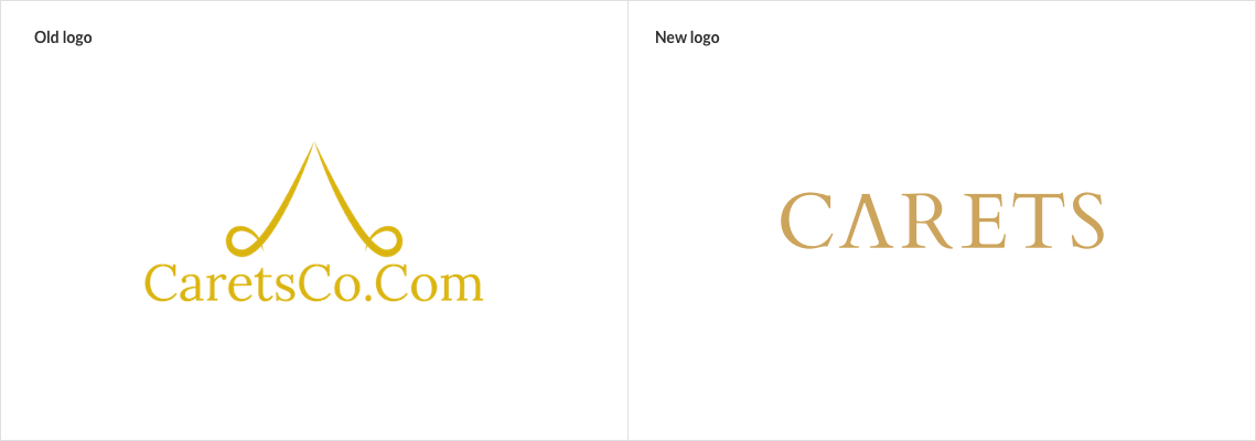
In today's world, many people prefer to shop on mobile devices. This has led some companies to adopt a mobile-first approach in recent years. By examining analytical reports, I discovered that traffic was almost equally divided between desktop and mobile, but people seemed to prefer shopping from desktops. Why was this the case?
A few obvious reasons:
1 - The mobile screen was cluttered with unnecessary information, forcing customers to scroll without purpose.
2 - The product page had excessive empty space, pushing vital CTAs below the fold.
3 - The color selection field was redundant since the site was selling only one color.
4 - The "add to cart" button was smaller than the dropdown menus.
5 - There was a lack of personalized information on the product page.
Branding
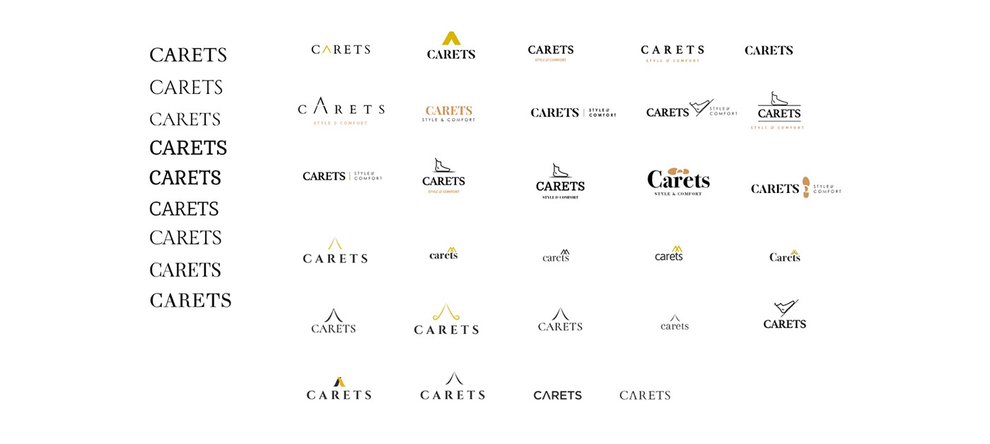
After getting to know the full scope of the project, I embarked on the initial task of redesigning Carets' logo, a specific requirement that I was excited about. This redesign allowed me to delve deeper into understanding the core values of their brand. Crafting the logo at the project's onset helped set the visual tone of the brand, aligning with the idea that a brand is akin to an individual's gut feeling about a particular product or company. Each person interprets a brand uniquely, and its popularity can fluctuate based on consumer sentiment. Carets was seeking a sharp and edgy feel while retaining the color and concept of their existing logo, as it resonated with the meaning of their name "Carets."
I will not dig much into the process and the exploration for their new logo but in all this exploration I finalized the tone of the brand, the new gold shade, and new font.
Prototypes
I tend to outline the user experience through prototypes, as I find it consistently beneficial. This approach allows for rapid iteration in collaboration with clients, without getting bogged down in pixel-perfect details. It also saves time later on, ensuring a firmer grasp during the UI stage. For Carets, I focused on three key pages (home, product listing, and product detail) and crafted various layouts tailored to user needs, based on data, surveys, and some assumptions. I utilized Invisionapp for collaboration with the Carets team, and I must acknowledge that it proved to be quite handy. The prototypes illustrated below represent the final wireframes, arrived at after many iterations.

User Interface Design
With Carets, the goal was to forge a visual approach that seamlessly blended the contemporary with the classic. To achieve this delicate balance, I turned to a blend of Serif and Sans-Serif fonts, giving the design an edge that was simultaneously sharp and elegant.
Starting with Carets' new logo, I meticulously pared down any curves and rounded elements, imbuing the brand identity with a distinctive sharpness that resonated with their ethos. Carets had a clear vision of what they wanted, including retaining their existing brand color, a decision that I fully supported. However, I sought to elevate their gold tone to a richer hue. Together, we embarked on a fascinating exploration of various gold tones, finally settling on one that encapsulated the unique blend of tradition and innovation that Carets stands for. This thoughtful refinement added an extra layer of sophistication, enhancing the overall visual experience.
Here you can browse the website www.caretsco.com